Demo Data Insights
Project Snapshot
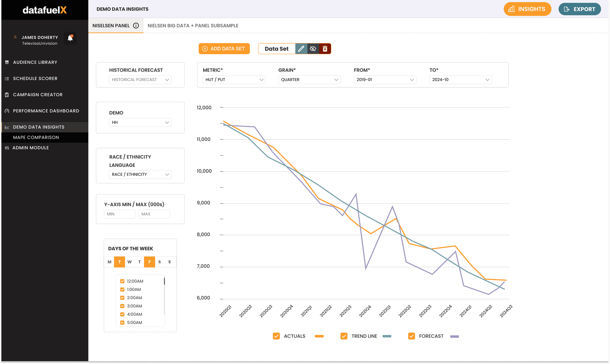
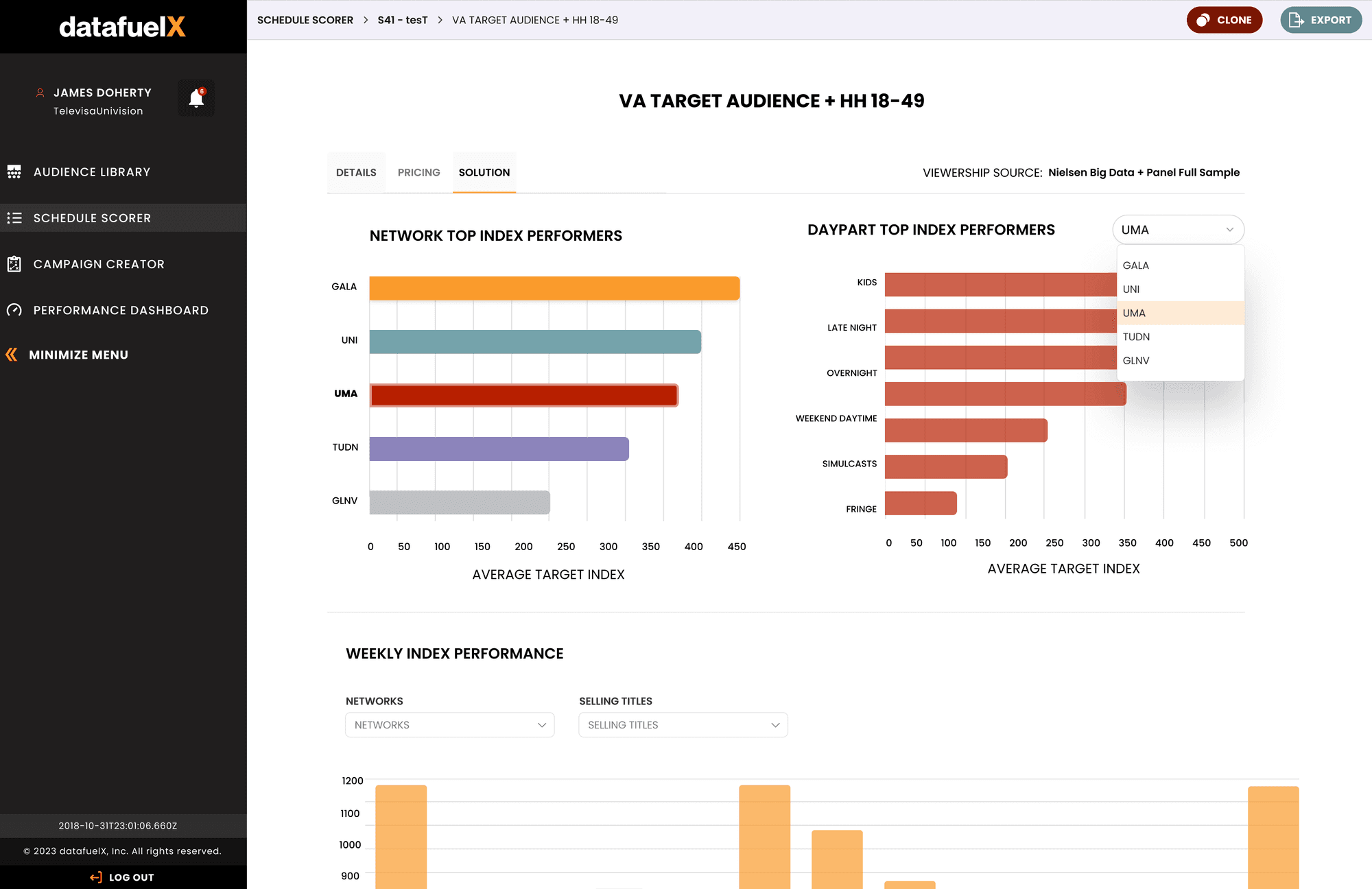
DataFuelX is a B2B SaaS platform providing predictive analytics for AdTech professionals. Integrating major data sources like Nielsen and VideoAmp, the core "Demo Data Insights" module transforms complex, granular datasets into accessible, visual workflows for strategy building.
The Challenge
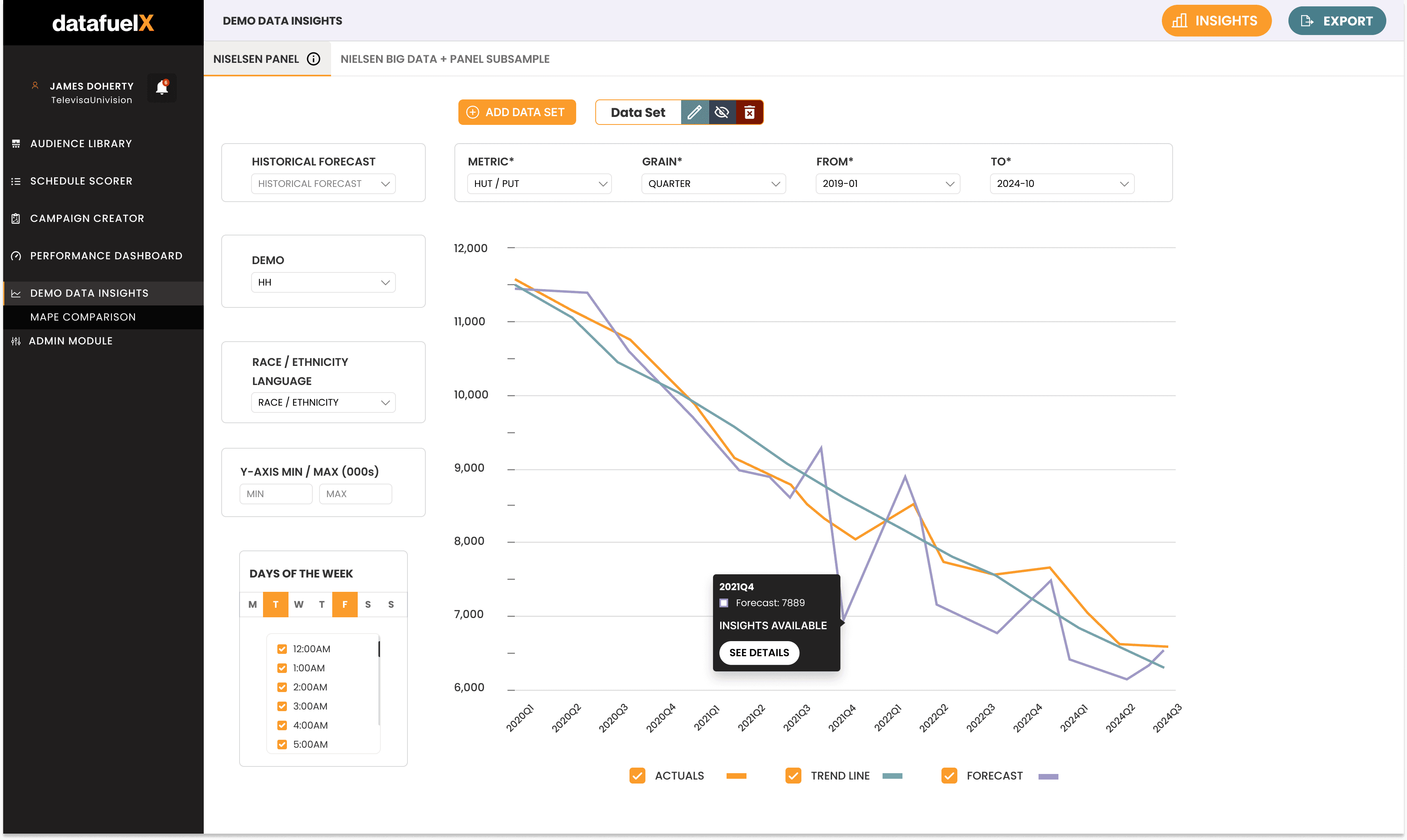
Users previously relied on static, Excel-based recommendations that hindered exploratory research. Despite having access to advanced modeling, professionals lacked the visual tools to meaningfully compare predictive forecasts against real-world performance data across different scenarios.
The Approach
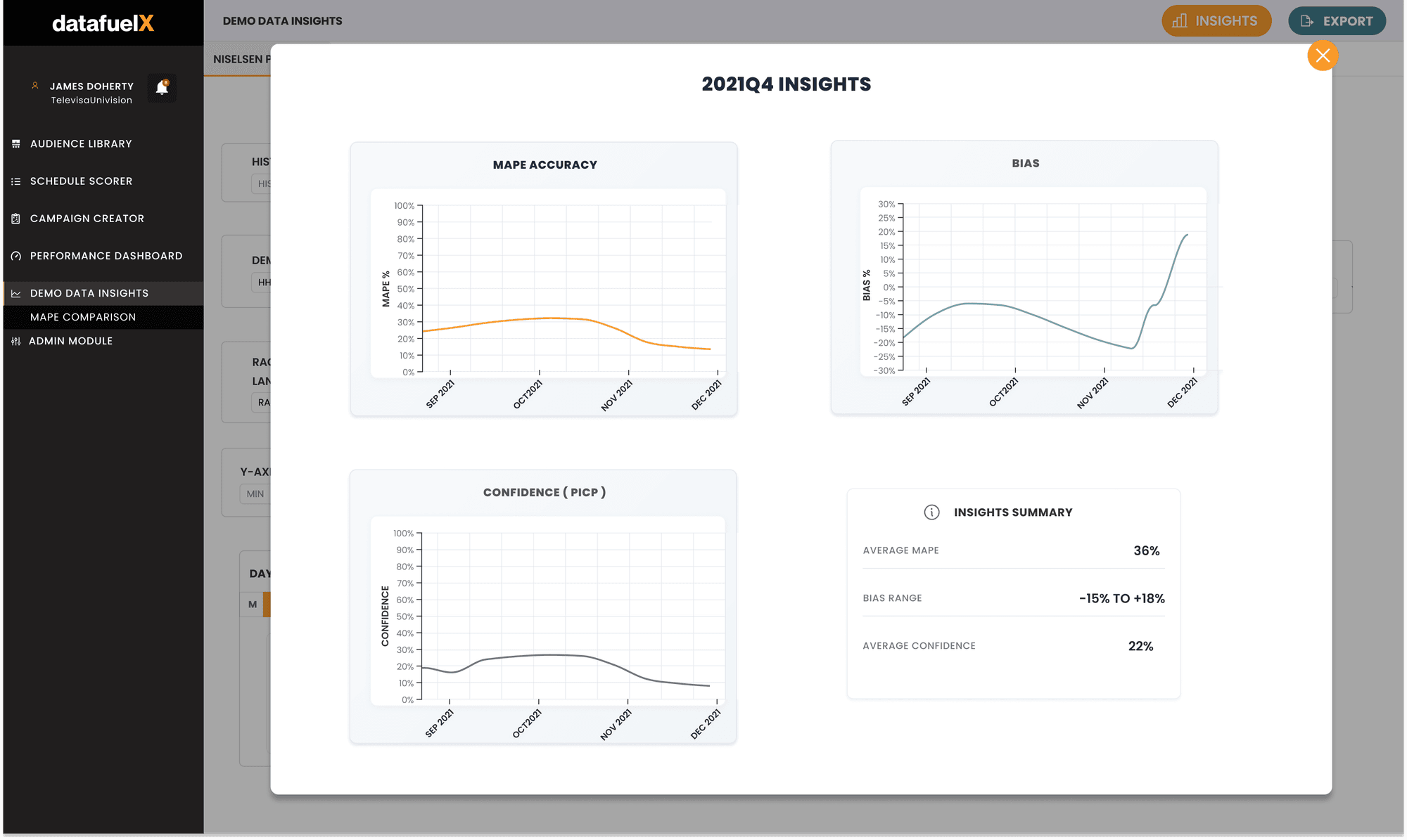
The solution facilitates iterative research by plotting three critical metrics: Actuals (real performance), Trendlines (expected trajectory), and Forecasts (ML predictions). To manage visual load, the UI utilizes opacity and distinct color hierarchies, ensuring users can layer multiple data sets without losing legibility.
High-Fidelity Prototyping
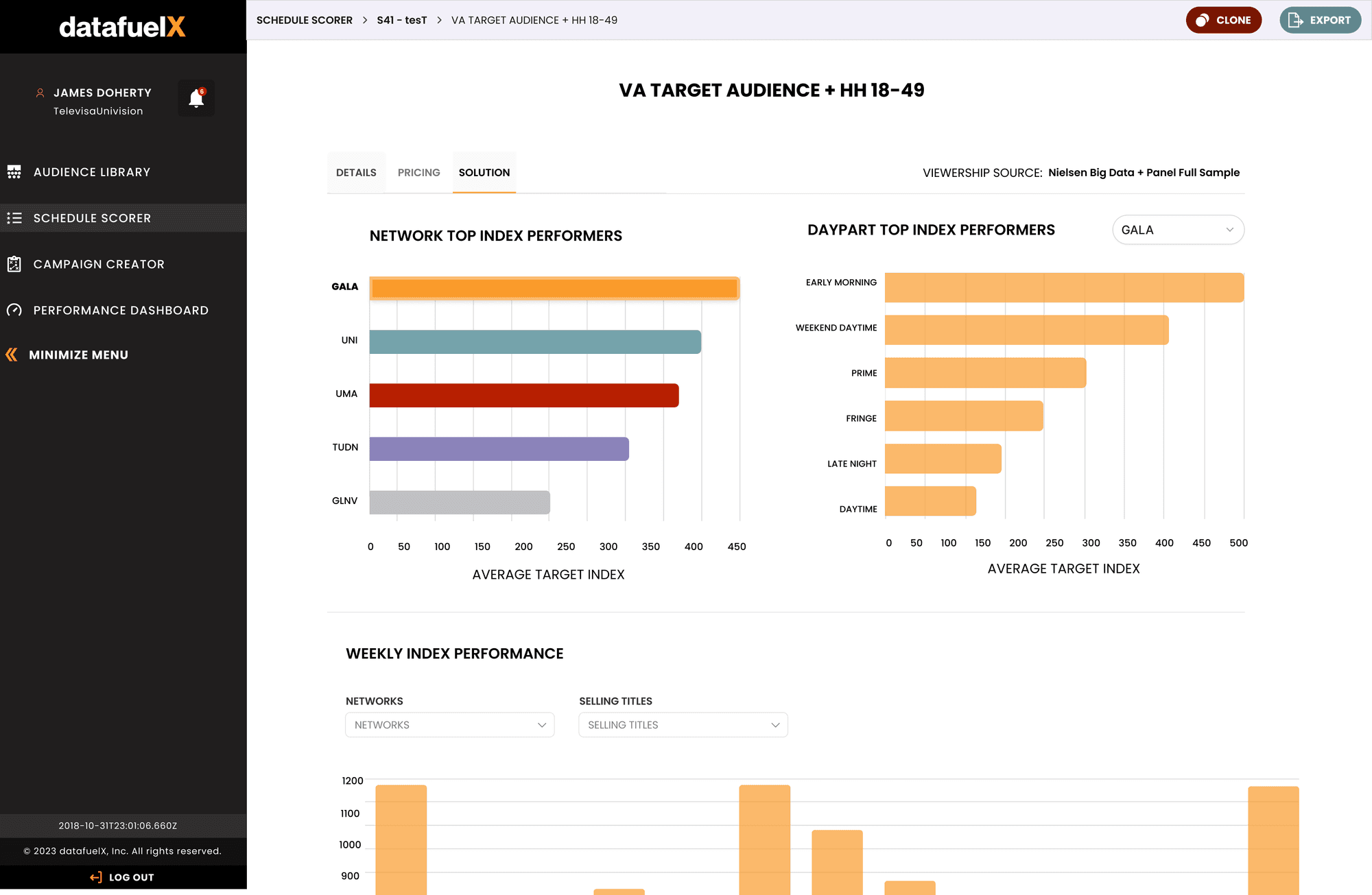
To validate these complex interactions, I moved beyond static design tools to build a functional prototype using JavaScript and Chart.js. This approach allowed us to simulate realistic trend behaviors and test forecast toggling logic effectively before handing off to engineering. Having said that creating Figma mockups first help us visualize the essentials of the concept first.
The Impact
The consolidated view cut the time analysts spent in excel or python and gave teams a faster, more confident path towards extracting demographic insights quickly