Core UI / UX
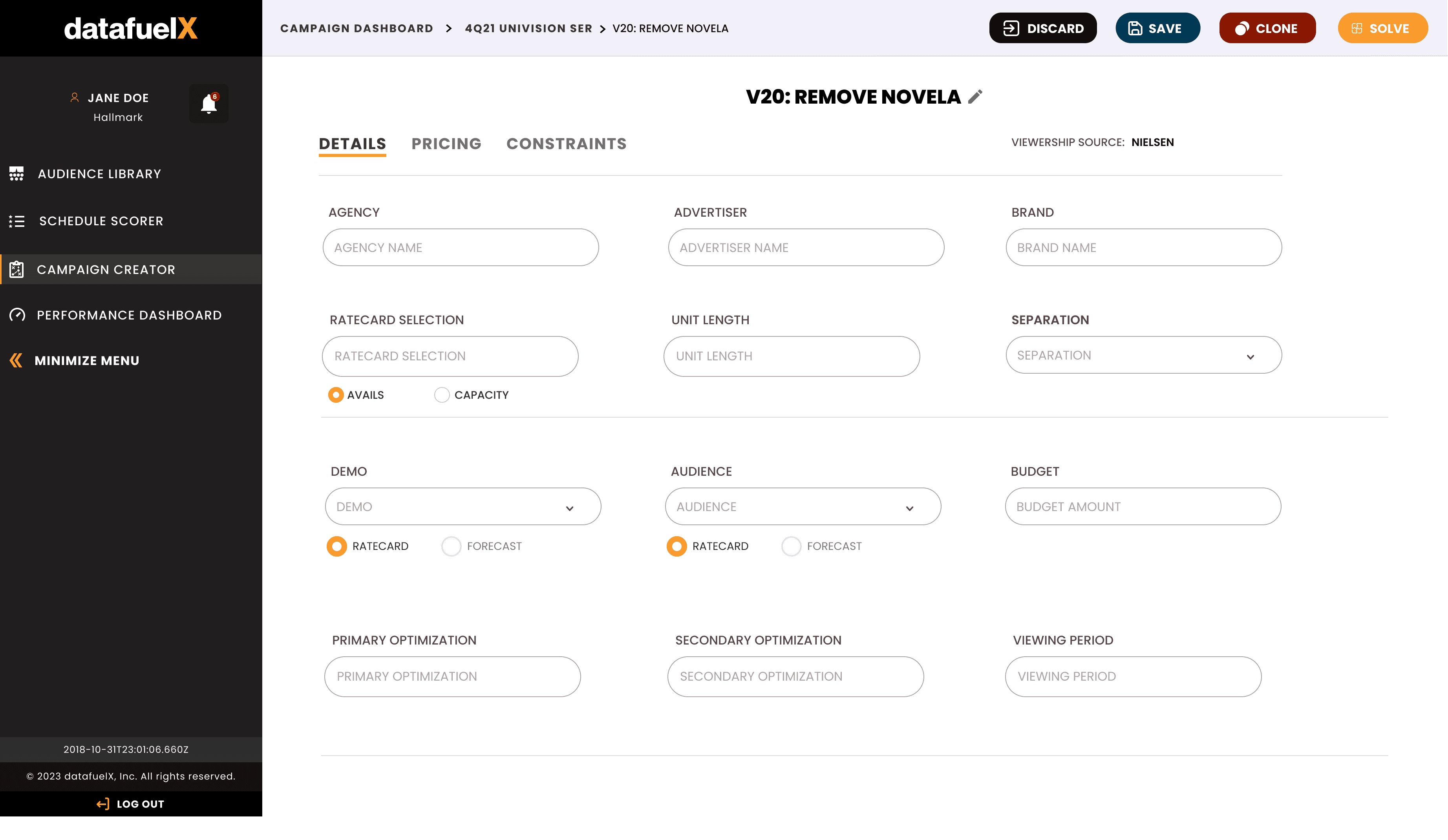
Orchestrating Complex Workflows
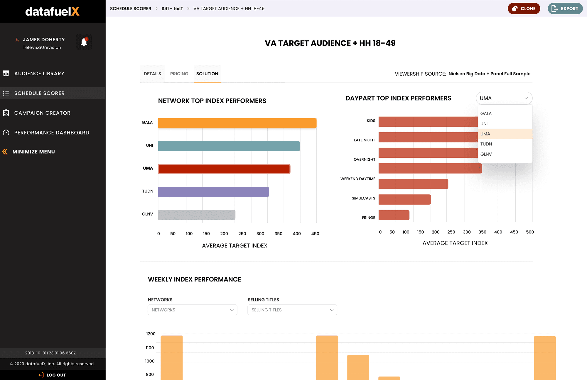
My primary objective was translating manual spreadsheet workflows into a streamlined SaaS interface. The UI serves as an intuitive wrapper for a powerful Machine Learning optimizer. Users input complex constraints, goals, and budgets, and the system processes these to return data-driven strategies. The design priority was reducing cognitive load while retaining the granular control ad-tech professionals require.
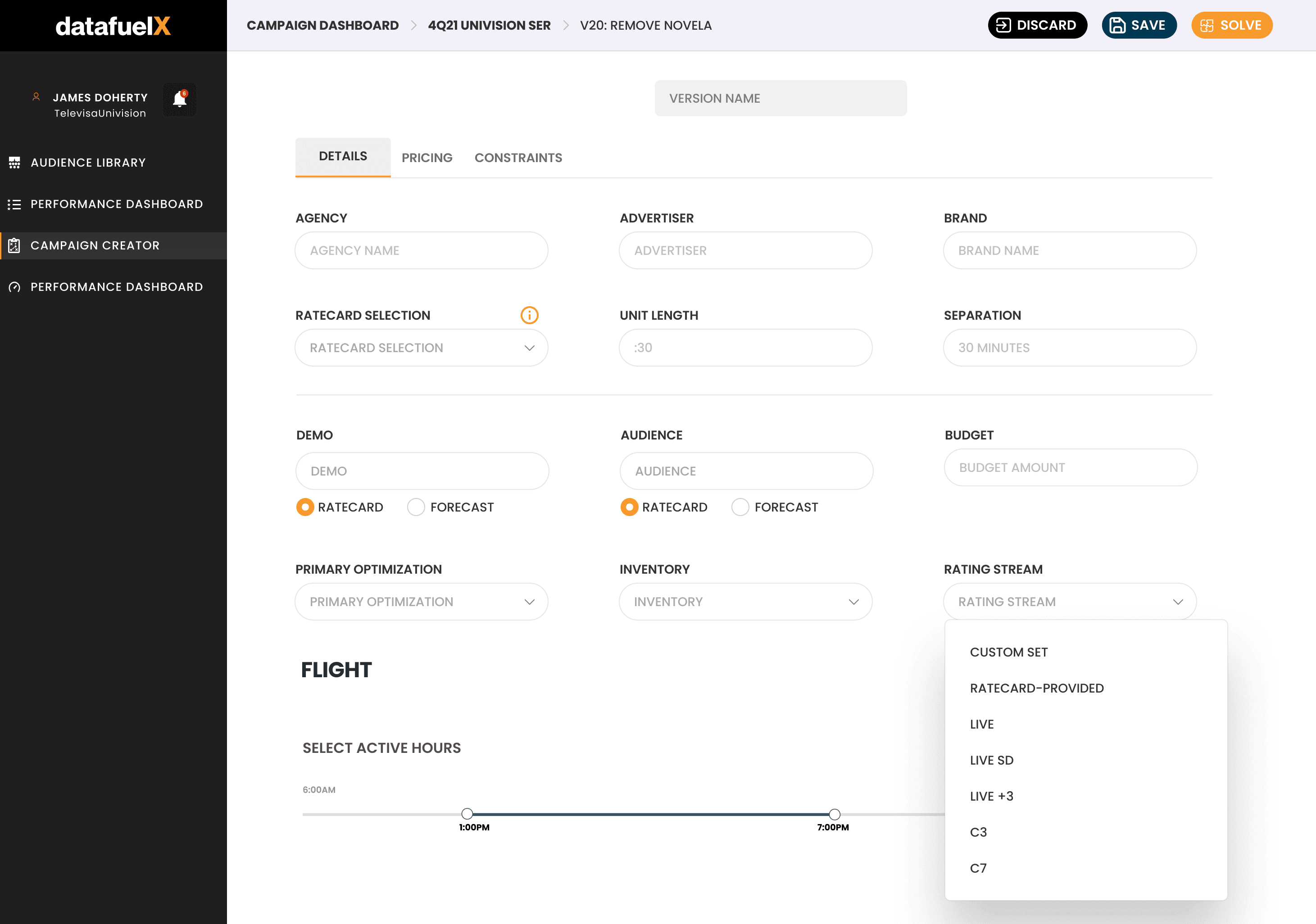
Precision Configuration
The interface is designed to handle high-density data entry without overwhelming the user. By utilizing tabbed views for "Details," "Pricing," and "Constraints," the workspace remains clean and scannable. I developed standardized patterns for domain-specific interactions, such as toggling between "Ratecard" and "Forecast" sources or configuring "Rating Streams" (e.g., Live, C3), ensuring users can efficiently build and solve complex flights
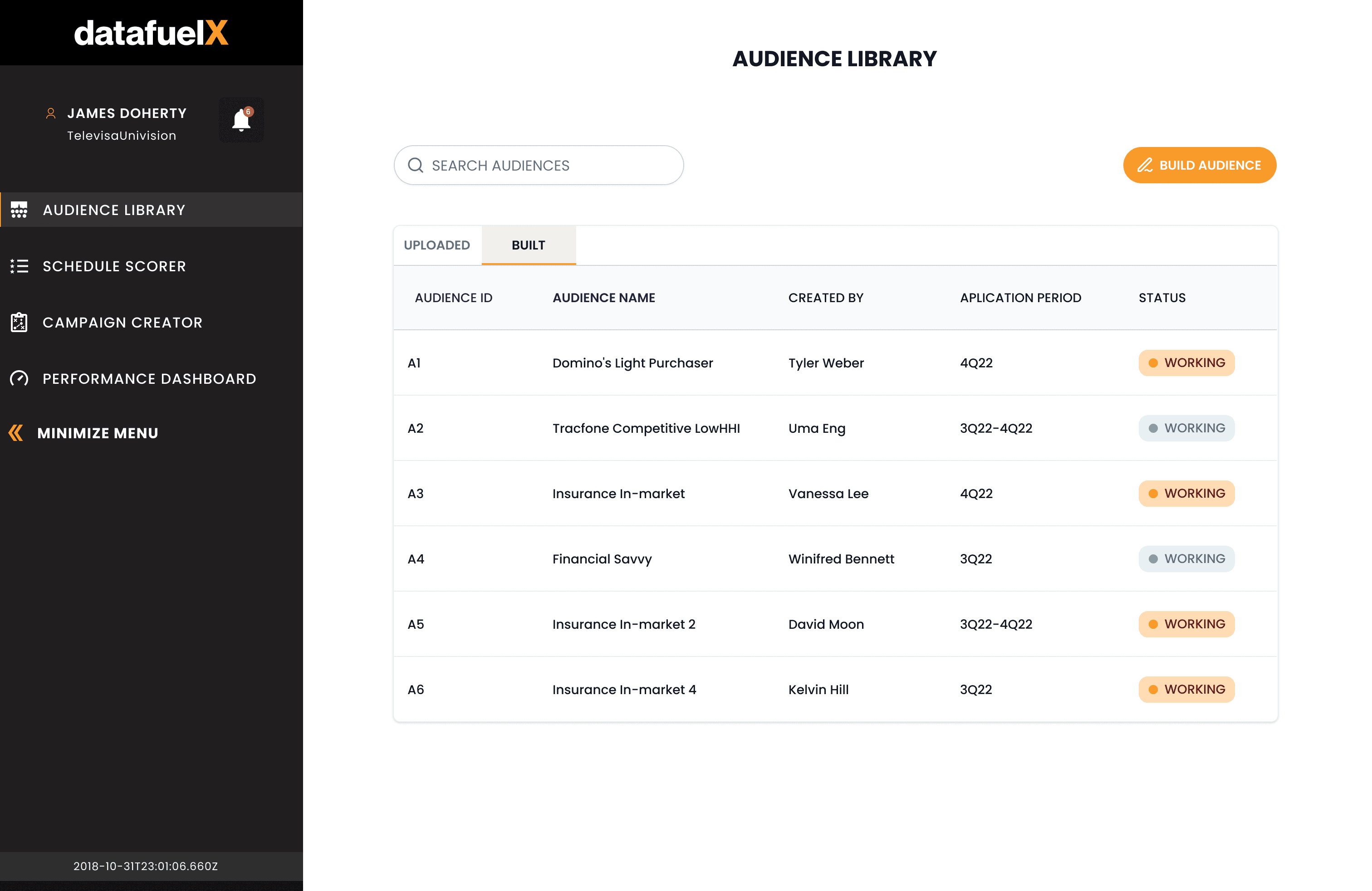
A Scalable Design System
To support this scale as a solo designer, I architected a system that bridges the gap between design and development. While utilizing Ant Design as a foundational code base, I customized the UI components using Figma variables and tokenized logic to meet DataFuelX’s specific needs. This systematic approach ensured visual consistency, component reusability, and a seamless handoff process for engineering.
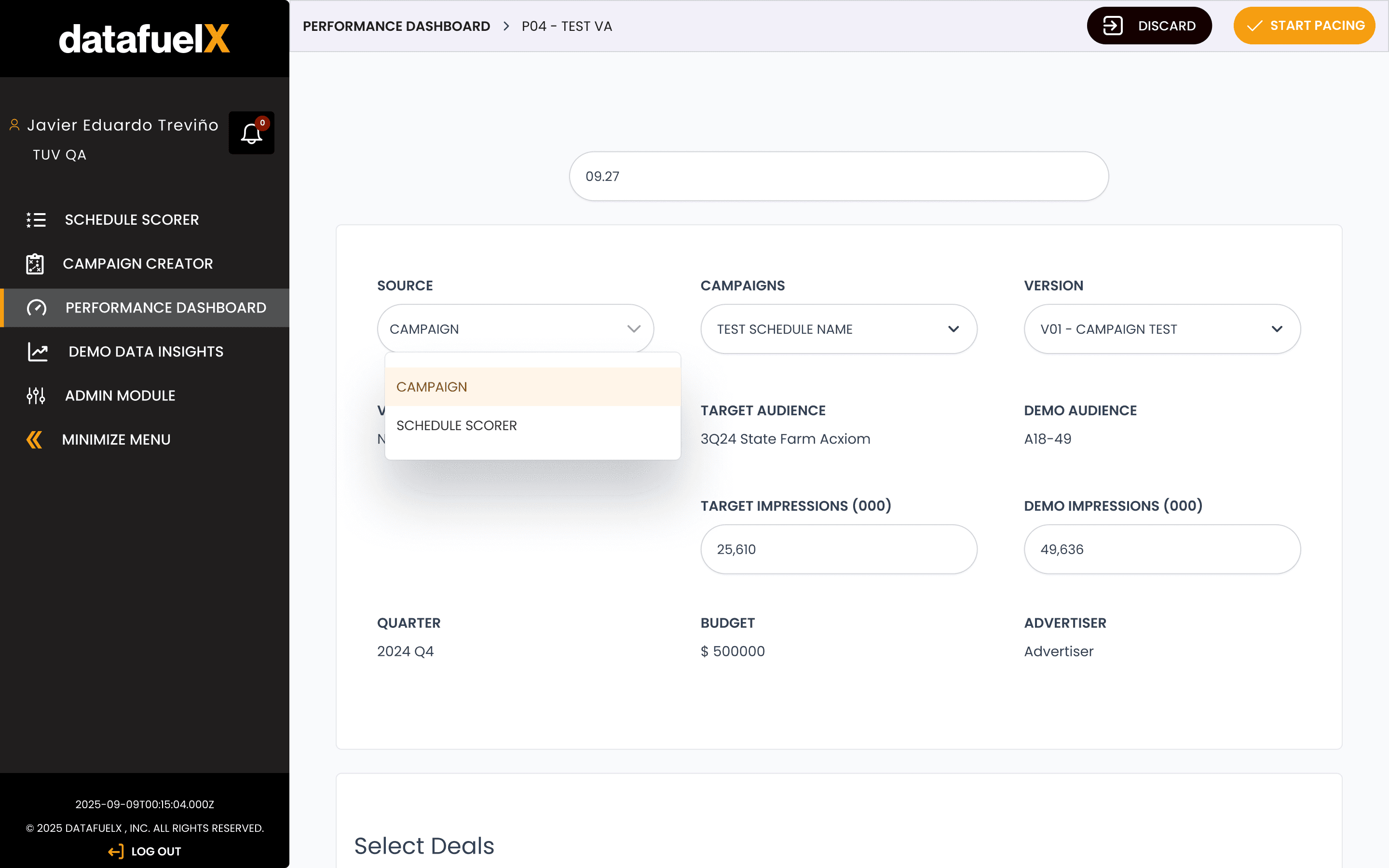
Minimalism
The UI seems simple but the rationale behind every layout and component is rooted in serious craft and research that makes b2b users productive
The Impact
The intuitive UI wrapper, so to speak, allows analysts to collaborate with the company's powerful ML and AI engine , utlimately providing the recommendations they need